
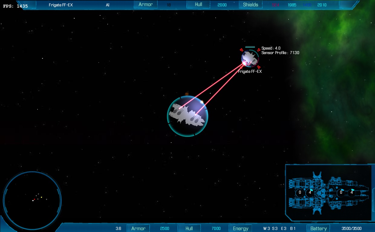
 I spent last few days working on some details but mostly on new HUD. Big thanks to Mizzin for the graphics. The HUD has 3 modes, which can be toggled. One is the standard full HUD, but there is also one without any interface at all and one with only targeting and shields. Target information is also adjustable.
I also finally changed the shield indicators to some nicer textures. And I am currently experimenting with color schemes for the indicators (shields, hull etc.). Let me know, if you have some ideas about that. At the moment I have two favorites : the basic green-yellow-red and the blue-violet-red. The second fits better to the current HUD, but in my opinion is not so clearly readable. One may be confused if blue is better than violet.
But the HUD definition and skin is configurable per ship so the player can change it for himself.
Selecting the font for HUD was also quite difficult. After few hours of trying the best I could found is the one you can see on the screenshot.
Language
-
Recent Posts
Recent Comments
- admin on Final War 3 – Star Trek mod update 0.80
- Vladimír on Final War 3 – Star Trek mod update 0.80
- admin on Basic controls
- Fanda on Basic controls
- admin on Download
Archives
Categories
Meta
Links
ja bych dal přednost stare zeleno-žluto-červené-šedé barvě.